 A bit more than three years ago (on February 3, 2021, to be specific), I posted a Wednesday Wow about COVID-19. Seeing the reported numbers in the news back then inspired me to obtain my own dataset and do some analysis. The results then were jaw-dropping, hence the Wow!
For quite a few months now I’ve been meaning to do an update to see what’s happened since then. Yesterday I pulled a new dataset and re-did the analysis.
The results are still jaw-dropping. And horrific and sorrowful.
Let’s start with some numbers. Worldwide there have been 775,132,072 reported cases of COVID, 103,436,829 of them in the USA. Rounding the world’s population to an even eight billion, almost 10% of the world has had COVID at some point. You probably know several people who’ve had it even if you have escaped it yourself (as I have).
Just to emphasize those first two numbers, that’s a bit over three-quarters of a billion cases worldwide and over one-hundred million in the USA.
And here in the USA, with a population of 338,289,856, just a hair over 30% of people have had it — three times the worldwide rate. Which, as you’ll see below, doesn’t even put us in the top 30 countries. We’re not even in the top 50 (we’re #69). The “winner” in reported cases is Cyprus, with a rate of 77%.
Here’s a chart of reported cases that focuses on some key countries:

Reported COVID cases for the USA, Brazil (BRA), India (IND), Russia (RUS), Mexico (MEX), and Great Britain (GBR). [Click for big’n.]
As you can see, the worldwide total is, as they say, “off the chart”, so here’s a version with the vertical scale set to include the worldwide plot:

Reported COVID cases with vertical scale set to include worldwide cases. The selected countries are a fraction of those worldwide.
Which makes it pretty obvious that the rest of the world has been hit pretty hard. I picked the six countries I did because they have the most reported COVID deaths (by numbers, not percentages).
Speaking of which, here’s a pie chart calling out the top 15 countries by number of COVID deaths:

Reported COVID deaths, top 15 countries. (PER=Peru, ITA=Italy, DEU=Germany, FRA=France, IDN=Indonesia, IRN=Iran, COL=Colombia, ARG=Argentina, CHN=China)
The six selected countries (USA, Brazil, India, Russia, Mexico, and Great Britain) account for a bit less than 50% of the total death toll worldwide.
Note that China, even with its huge population, only ranks 15th. In terms of percentage of population, it ranks 201st (with a death rate of 0.009%). Their infection rate is only 6.9% compared to our 30%. And compare their 1.4 billion people to our 338 million. Our death rate is much higher, too: 0.35% of the people here died from COVID.
Why? Duh! Masks. Masks work, and the Chinese were into wearing masks long before COVID hit. So, to those of you who resisted masks, thanks for helping to kill over one-third of a percent of your country. And fuck you very hugely.
Here is a chart with rankings showing reported cases and deaths for the top 30 countries:
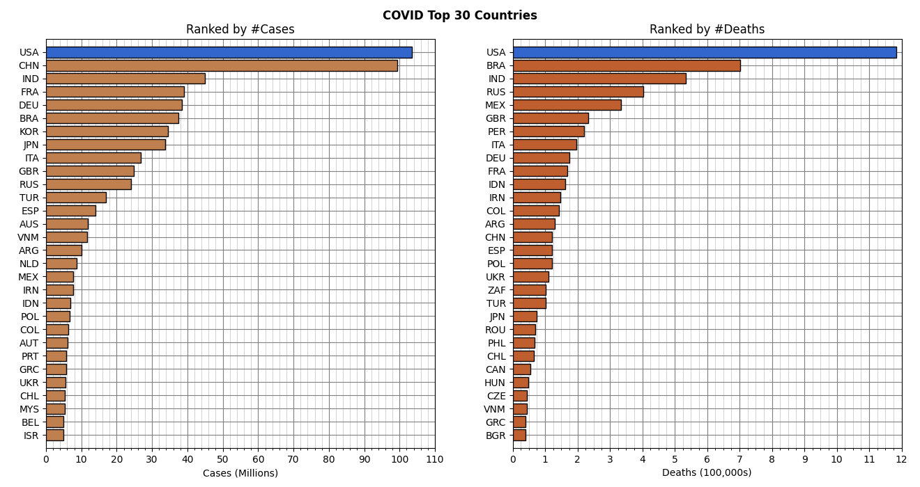
Reported COVID cases and deaths for the top 30 countries. Population obviously matters in terms of number of cases or deaths.
And here is a similar chart showing the same ranking but by percentage of population:
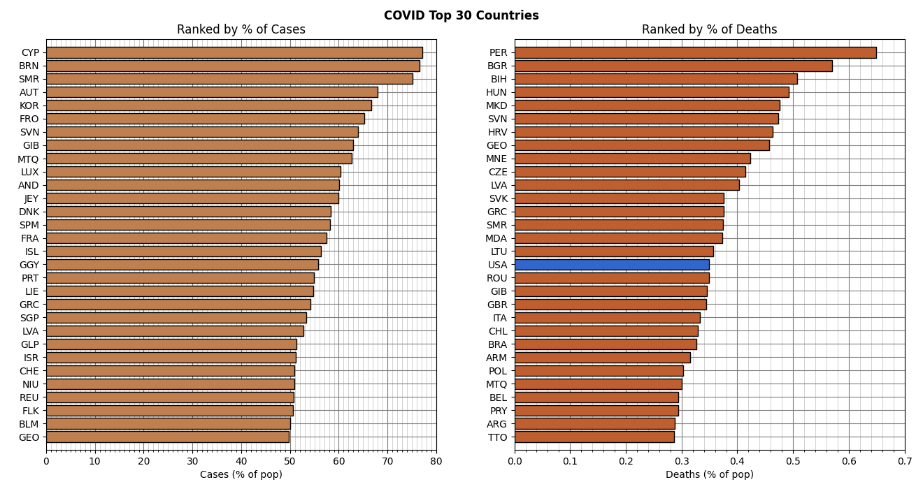
Percentage of COVID cases and deaths for the top 30 countries.
As I mentioned above, the USA isn’t in the top 30 of reported cases by percentage, but we’re #17 in terms of reported deaths.
Here’s a chart showing the percentage (by population) of reported cases:
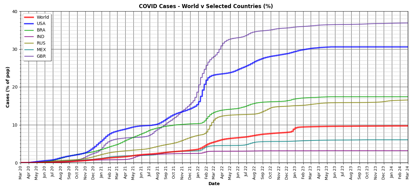
Percentage (by population) of reported COVID cases for selected countries and the world. [Reminder: click for big’n on any of these.]
Of the selected countries, Great Britain had a higher percentage of reported cases (36.9% compared to our 30.6%). Note that all but India (3.18%) and Mexico (6.05%) are notably above the worldwide percentage (9.72%).
Here’s a similar chart showing the percentage of reported deaths:
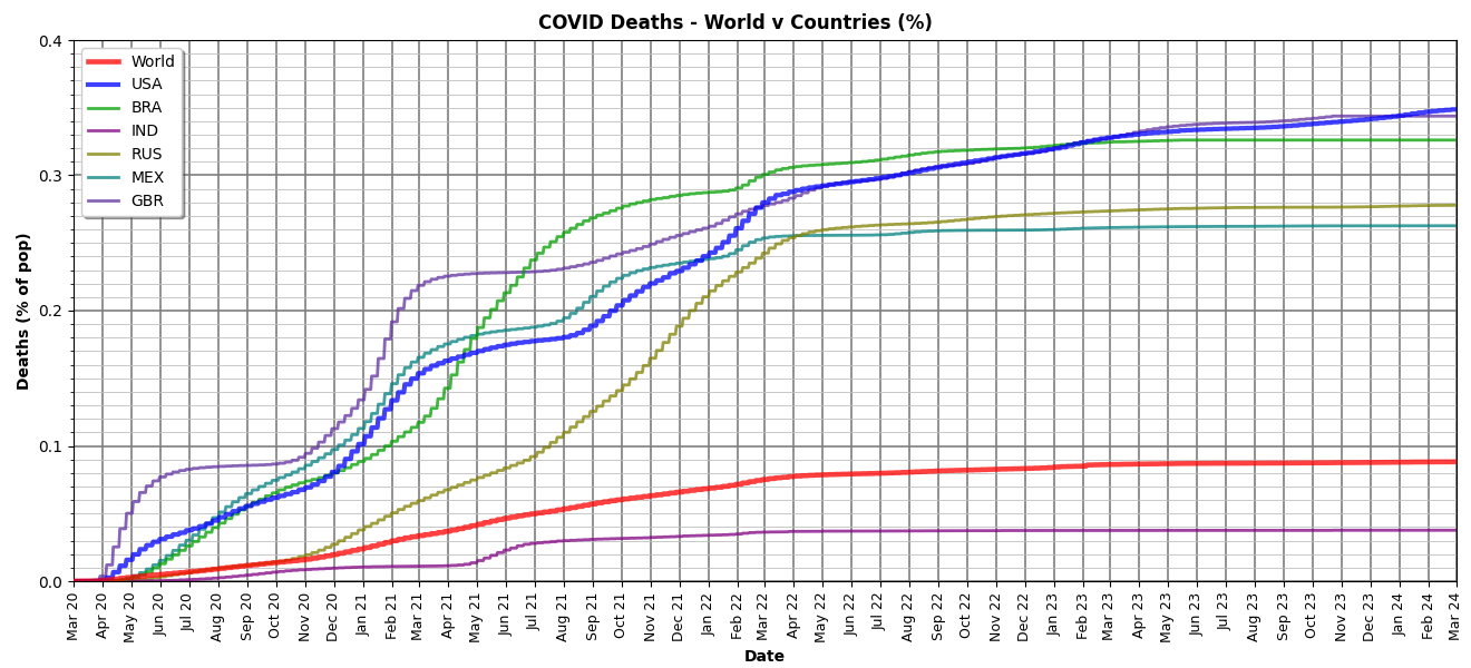
Percentage (by population) of reported COVID deaths for selected countries and the world.
Great Britain got hit harder early on, then Brazil surged ahead of it, but later fell slightly behind. We started off slower, then equaled our friends in the UK, and finally ended slightly ahead (0.35% versus 0.344%). Let that sink in a bit: over one-third of one percent of people died of COVID in these two supposedly highly civilized industrial scientific countries.
Note here that only India (0.038%) was below the worldwide percentage (0.088%). That’s especially notable considering India, like China, has a population of 1.4 billion people. Recall that, as mentioned above, China had an infection rate of 6.97% (compared to India’s 3.18%) and a death rate of just 0.009% — a tiny fraction of India’s (which was, in turn, only a tenth of ours and the UK’s).
Pretty clear which major country is way stupider. (For the record, our population of 338,289,856 ranks us as third behind China and India.)
Semi-lastly, here’s a chart showing reported deaths per reported cases:

COVID deaths per cases for selected countries and worldwide.
In other words, how many people who caught the COVID died from it. Great Britain did the worst here followed by Mexico, but the former improved to average within nine months. Mexico still has a very high rate of death per case. And we in the USA did better than world average, at least until the last year or so when we’ve been just slightly higher.
Above I said “semi-lastly” because, while the above charts tell the story pretty well, I do have a few more my software generated.
Here’s one similar to the first chart, which showed reported cases, but showing reported deaths:

Reported COVID deaths for selected countries and worldwide.
And here’s one (similar to the second chart) with the same data but scaled to include the worldwide plot:
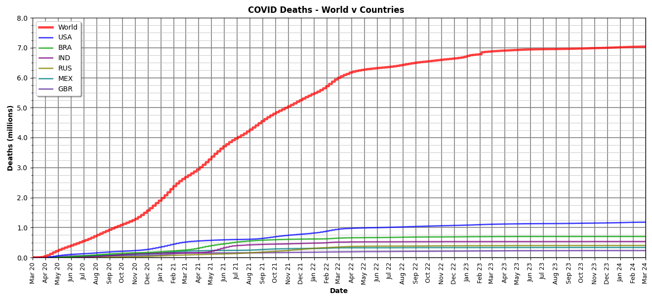
Same as above but scaled to include worldwide plot.
As a reminder, 80 million people died in the six years of WWII, the deadliest war in modern history. In contrast, “only” 7 million people have died from COVID (in the four years of this dataset). On the other hand, WWII killed 407,300 Americans, but our COVID death toll is 1,183,372 — almost three times as many.
What we can take as a bit of good news is that, as the charts show, both reported cases and reported deaths have largely leveled out in the last year. Sadly, the curves for the USA still show a small increase over time. People are still dying, so maybe in a few more years I’ll have to do this analysis all over again.
Lastly, here’s a chart showing reported cases per day:
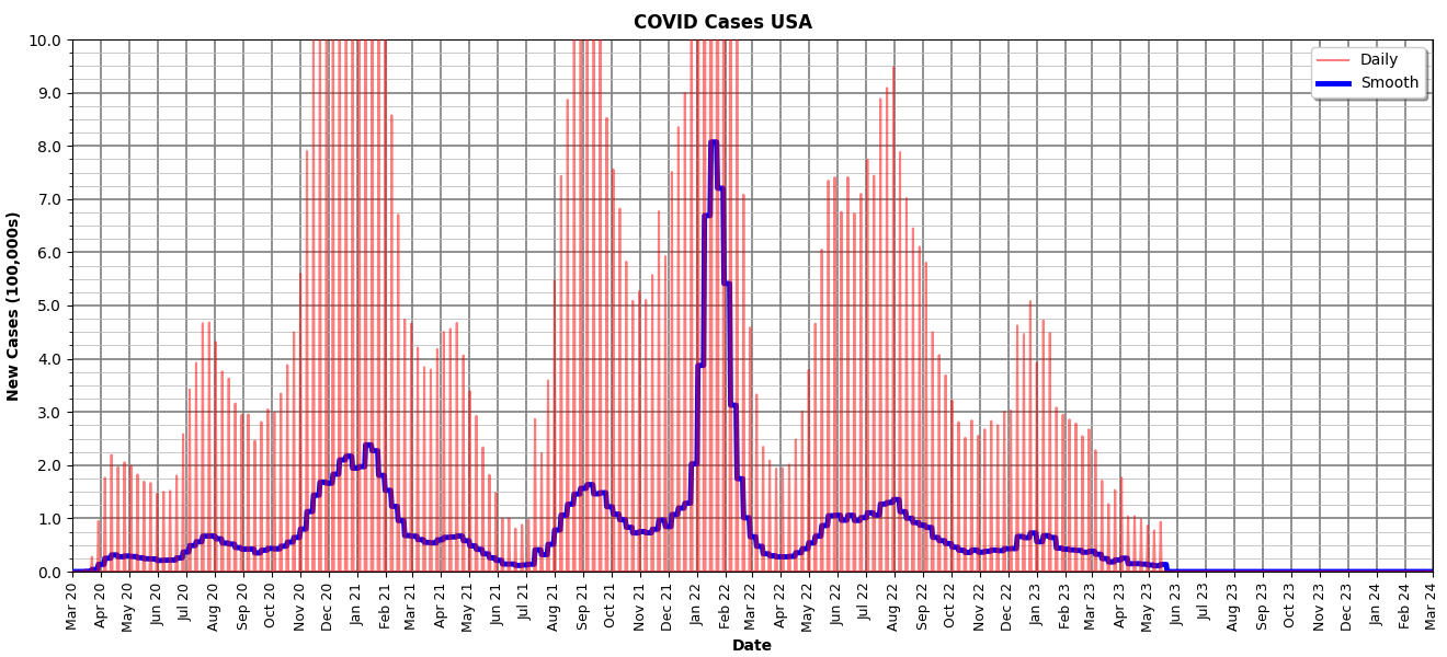
COVID cases reported per day, raw (red) and smoothed (blue).
And (the last chart) showing reported deaths per day:
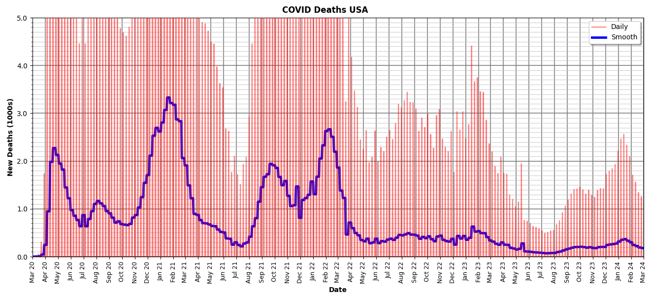
COVID deaths reported per day, raw (red) and smoothed (blue).
The first chart appears to show zeros starting in June of 2023, but this appears to be missing data in the dataset. Rather than zeros, those fields (raw and smoothed reported cases) are blank. Not sure why.
All-in-all, as I said up top, jaw-dropping, horrific, and sorrowful.
§
The data come from the Mortality Risk of COVID-19 pages on the Our World in Data website. Specifically, the Coronavirus (COVID-19) Deaths page where I downloaded the complete COVID-19 dataset (as a CSV file). A good website for them what likes data.
If you’re interested in some of the lists my software generated (along with all the charts) here’s a ZIP file containing:
- All 12 charts (PNG image files)
- covid-owid-columns.txt — list of columns in the dataset including a list of all country codes with population, cases, and deaths. Useful if you pull the dataset from OWiD.
- covid-ranked-all.txt — four sorted lists of top 50 countries: number of cases, number of deaths, percent of cases, percent of deaths.
- covid-ranked-cases.txt — sorted percentage of reported cases for all 255 countries in the dataset.
- covid-ranked-deaths.txt — sorted percentage of reported deaths for all 255 countries in the dataset.
And with that, I’m done (and kind of emotionally drained). This was a Wednesday Wow of the wrong kind.
Stay healthy, my friends! Go forth and spread beauty and light.
∇


April 13th, 2024 at 10:48 am
I wonder what the estimates of the non-reported counts are. I know folks who got Covid, tested, confirmed but just dealt with it — never told anyone but family and work-mates.
I was already sequestered when Covid hit, work-from-home. And when out and about, masked up religiously. Boosted with all the shots too.
But, Covid was not the plague I’d hoped for. 80 million deaths would have been 1%. That’s not even adequate. 5% would have been better. 400 million dead. Yeah, now that’s an apocalypse. Mass graves, body-bonfires, quarantined cities, martial law.
April 13th, 2024 at 12:25 pm
The OWiD website does mention that unreported cases and deaths make the numbers higher. The data they present is only verified cases and deaths. So, no doubt total cases are at least 10% of the eight billion people. I, too, know people who got it (in some cases more than once), dealt with it, but never reported it to any official agency.
Heh, same here. I’ve always been an introvert and homebody, so I barely noticed the sequestering. Mostly it was in the need to wear a mask when out shopping. Likewise with the shots and boosters. I’ve never been one for “spic and span” cleaning nor do I hand sanitize, and I wonder if my immune system is a bit more robust than those who strenuously avoid dirt and germs.
Why settle for 400 million? Double it for a full decimation!
April 15th, 2024 at 3:24 pm
Yep, technically I never had covid; never tested. The figures can be played. I caught “it” early on (before the “vaccines” were rolled out), acquired my immunity naturally, yet still pressured to wear a mask (or whatever bit of cloth on the face constituted one) and social distance, which in my mind could have lead to my immunity wearing off… like with all the multi-jabbed people who still ended up catching it. I think any anger over the fiasco should be at aimed at those playing with such things in their labs.
April 16th, 2024 at 1:30 pm
FWIW, while the question of the origin of COVID-19 isn’t entirely resolved, most scientists who’ve studied it believe its origin is from animals, most likely bats through some intermediate animal. There seems no sign of genetic modification in the virus, and the animal-to-human connection for similar viruses is well-documented.
Also FWIW, while many vaccinated people catch COVID-19, the vaccines make it a milder case and usually prevent the need for hospitalization. For my friends who were vaccinated and caught it, it was much like having a bad cold.
April 16th, 2024 at 2:08 pm
I guess if you stick to only what comes out of mainstream media you’re not going to be privy to the understanding and insights of other researchers and experts who are not permitted to speak freely.
I think generally people who got vaxxed are going to think they would have had Covid worse if they hadn’t been. Plenty of people got laid up for a week from the vaccine itself, if not worse.
April 16th, 2024 at 3:01 pm
Well, I’ve never had much respect for mainstream media. Which is exactly why I go directly to the experts and researchers (and their data). They’re the ones who can speak with any authority.
If you look at the actual data, the death rate for the unvaccinated is considerably higher than for the vaccinated. At minimum, over 3 times as many and as high as 20 times. On average, about 7.7 times as many.
Put simply, vaccines work.
April 17th, 2024 at 9:31 am
Ok 😉
April 13th, 2024 at 12:57 pm
Malthusian, I like it.
April 13th, 2024 at 1:01 pm
It’s bound to happen sooner or later, if not from disease, then from the consequences of global warming. Growing seasons are already affected (and account for some of the higher grocery prices we’re seeing), and once migration from coastal and low-lying land begins, things are going to get tense.
April 14th, 2024 at 2:46 pm
Fantastic charts. Looks like it took a lot of work.
April 14th, 2024 at 5:43 pm
Thanks! Writing the software back in 2020 was a small project, but this time it was mostly a matter of downloading the new dataset and making some tweaks because they added fields to the dataset. Had to adjust the charts a bit for larger numbers and longer time span, but no biggie.
May 26th, 2024 at 9:16 am
[…] in four years. Over one million of them in the USA (taking more than our fair share again). [See The COVID Toll.] The lock-down put a lot of stress on a lot of people. On top of the whole sickness and dying […]